Libby Feature
A suggestion feature to help users more easily discover books they’ll enjoy.
Role
UX Research & Design
Usability Testing
Tools
Figma
Figjam

THE PROBLEM
Difficulty Finding New Books
Libby provides access to ebooks, audiobooks and magazines through the public library. Depending on the library, this could give access to over 250,000 titles to explore. But with so many options how do users know what to read?

THE CHALLENGE
How might we help users easily find books they will enjoy?

THE SOLUTION
Suggestions Feature
Place suggestions throughout the app when users need them most: when they first open the app, join a long waitlist or have just finished a book they enjoyed.
COMPETITIVE RESEARCH
How does Libby hold up to it’s competitors?
Libby is an e-reader app that has something other products can’t beat; free books. While there is a lot of accessible content, it’s missing the opportunity to help users find a book to keep them hooked.


USER RESEARCH

Learning how users currently interact with Libby

5 Libby Users • Power and casual users • Diverse interests
Learn what features people currently use on the app.
Determine how people discover new books.
Learn what other products people use to find books.
Discover how people decide what books to read.
Interview Goals:


User Insights


USER PERSONA
Libby User: The Casual Reader
This persona was a key reference point throughout my design process to keep the solution aligned to user needs.


SOLUTION
Add Suggestions at Key Points in the User Journey
USER FLOWS
The Happy Paths
As a casual reader, I want to discover a new ebook from Libby, so I can conveniently download a free copy and enjoy a good story.
As a waitlisted ebook lover, I want to find options similar to the story I put on hold, so I can enjoy something unexpected while waiting for the other book to become available.

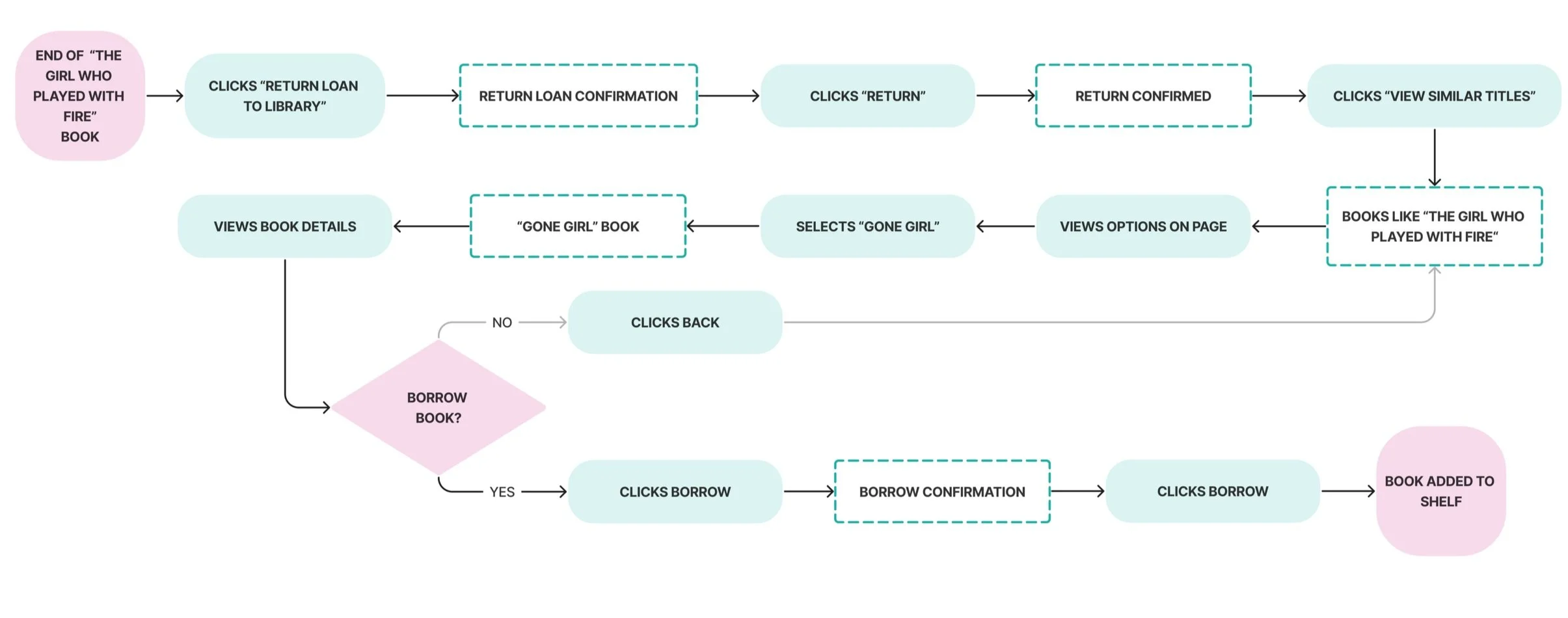
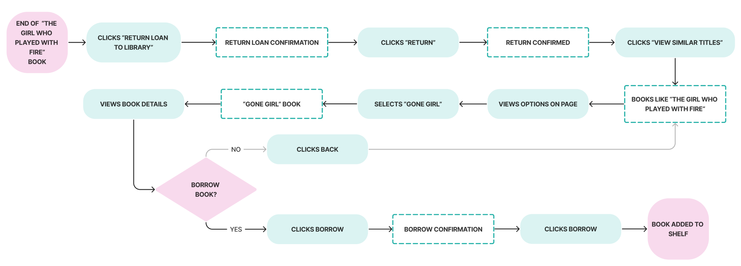
As an indecisive reader, I want to easily find options similar to the book I just finished reading, so I can quickly start reading my next book, instead of endlessly scrolling to find my next read.

LO-FI WIREFRAMES
Incorporating Suggestions into the Existing Platform
I kept a strong focus on hierarchy to determine where the new feature would fit most seamlessly within each screen and flow.
HOME SCREEN SUGGESTIONS


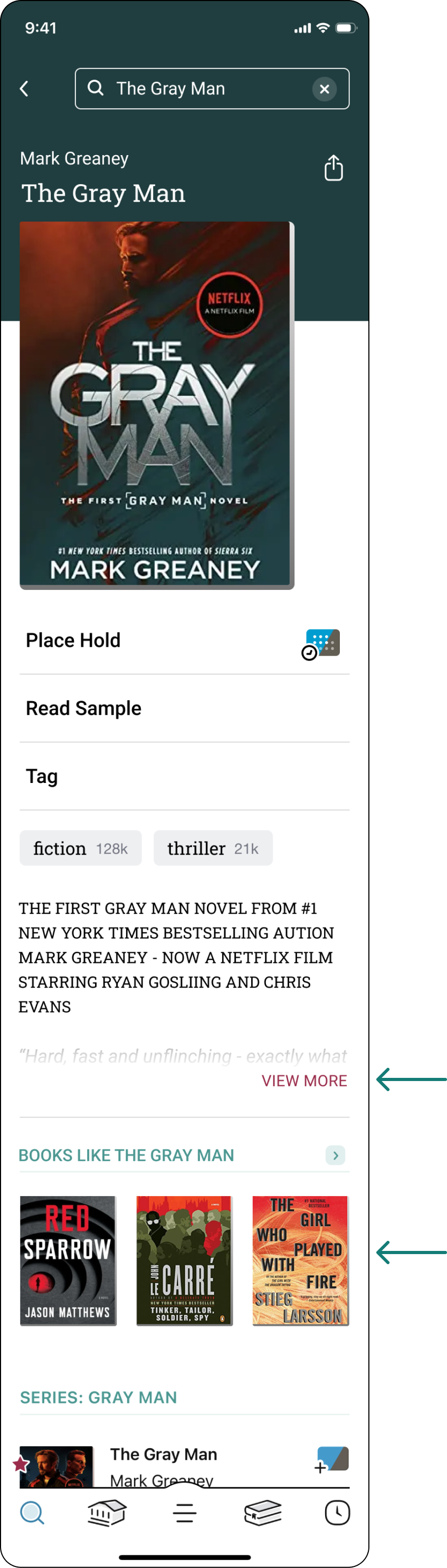
BOOK DETAIL SCREEN SUGGESTION
WAITLIST SUGGESTIONS


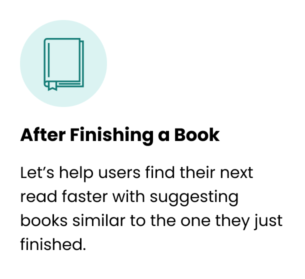
SUGGESTIONS AFTER RETURNING A BOOK


HI-FI WIREFRAMES
Stop the Endless Searching
& Start Reading
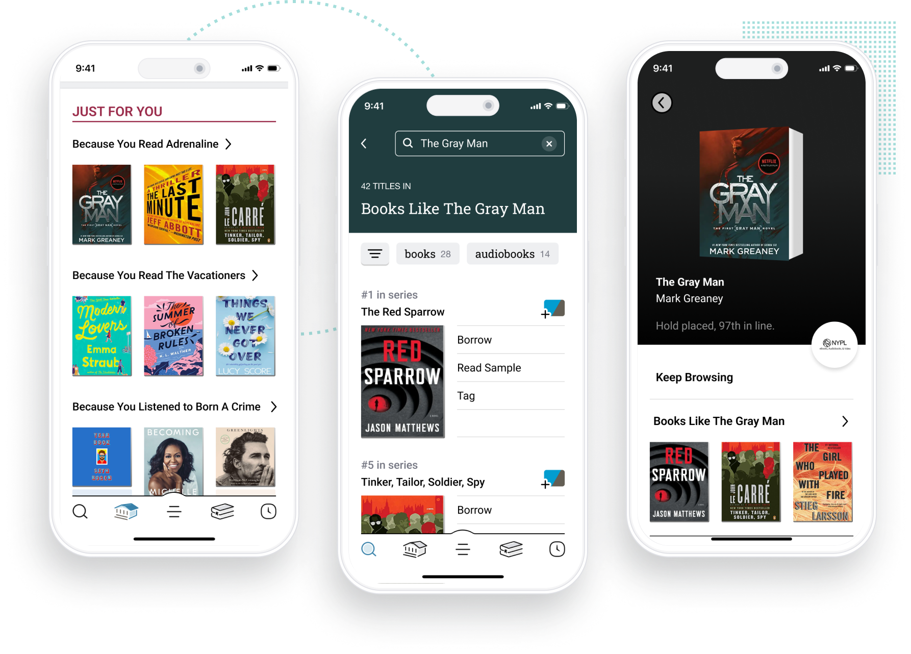
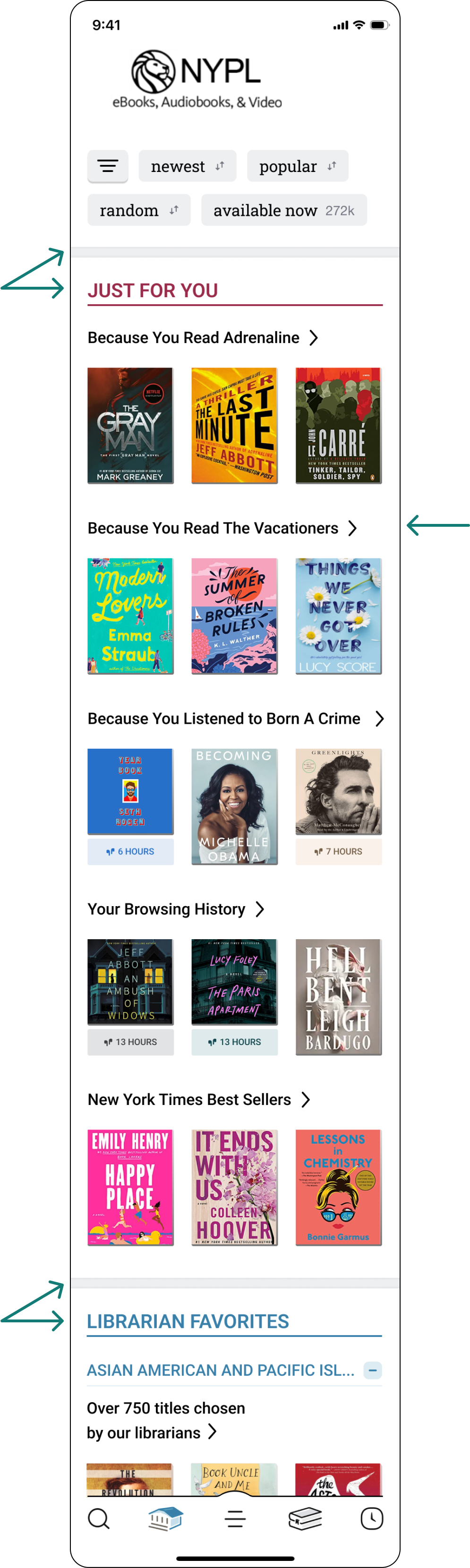
HOME SCREEN SUGGESTIONS

SIMILAR BOOK LIST
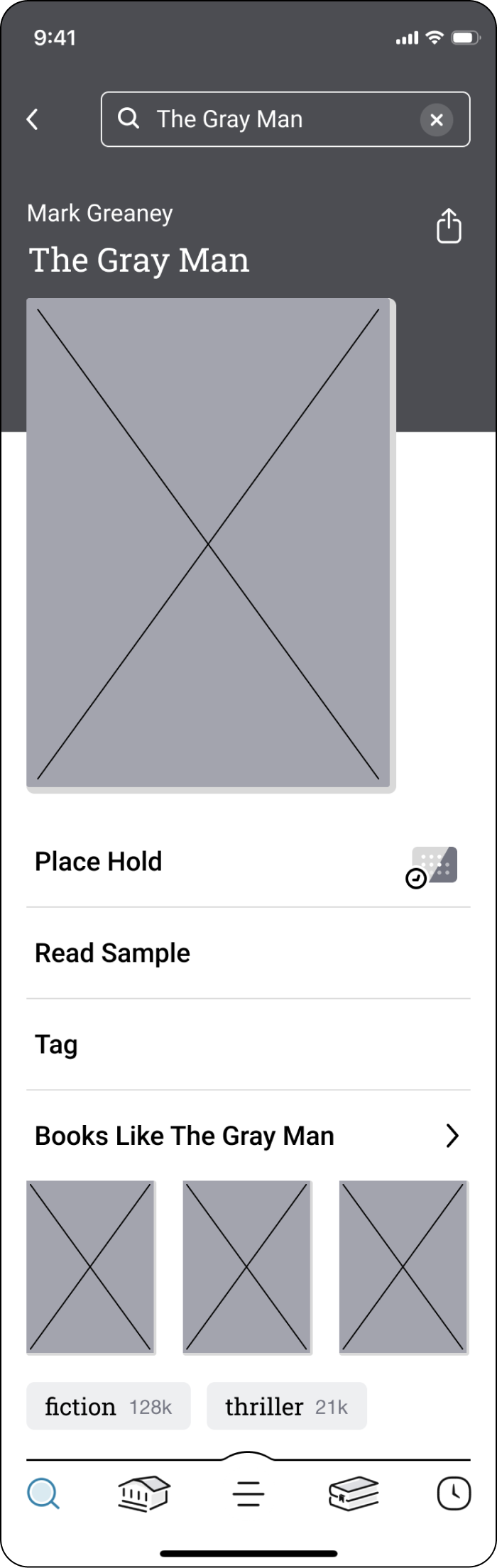
TITLE DETAIL SCREEN
JOIN WAITLIST
WAITLIST JOINED
SIMILAR BOOK LIST
RETURN BOOK

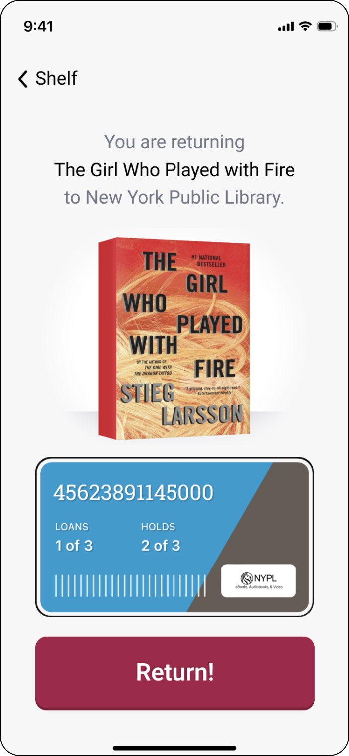
BOOK RETURNED
SIMILAR BOOK LIST


USABILITY TESTING
Handing It Back to Users
After incorporating the new feature into a funcitoning prototype I sought out feedback from both power users and casual users of the Libby app.

Goals & Success Metrics


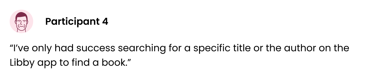
TEST RESULTS
How did the prototype perform?
I handed the prototype over to individuals experienced with using the Libby app to hear their thoughts on the new feature.


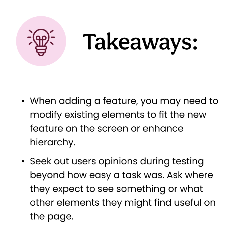
PRIORITY REVISIONS
Back to the Drawing Board
Usability tests provided me with valuable insights into what areas of my design needed iteration. I narrowed down to the 4 most impactful changes I could make to my prototype.
Library Homepage
Before Testing
The difference between personal suggestions and librarian categories wasn’t clear to some users.
Three users wanted to see more suggestions based on a book they had previously read.
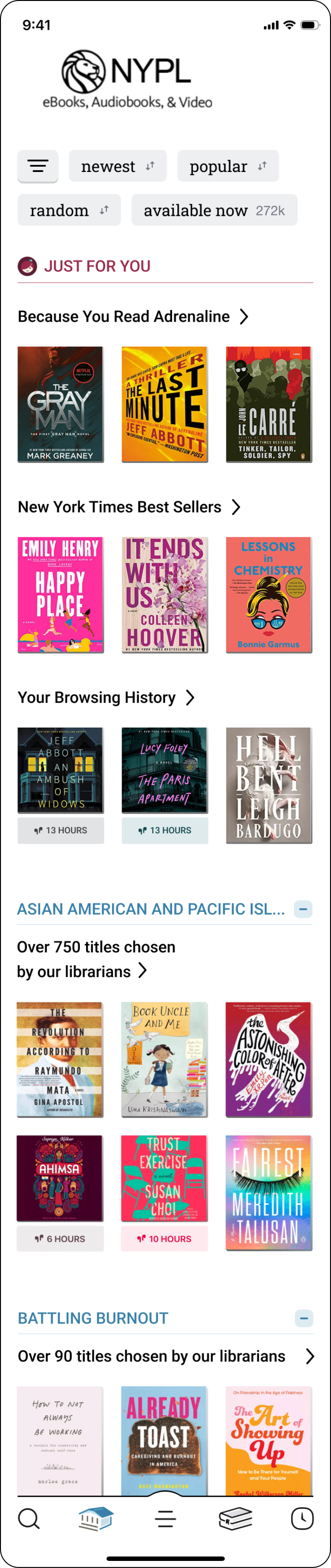
After Testing
For a clearer distinction between personal and librarian categories I made the headers larger and added a gray line to create more separation.
I added 2 more categories based on books the user had completed.
Book Detail Page
Before Testing
3/5 users expressed they would prefer to read the book summary before seeing similar suggestions.
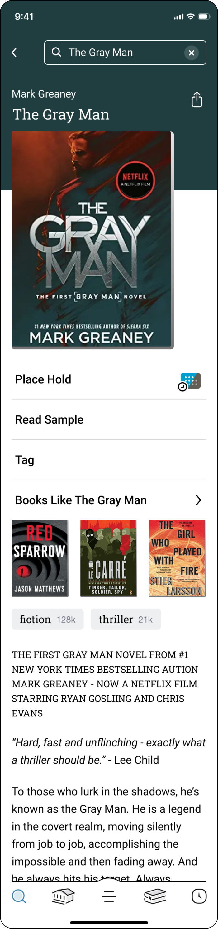
After Testing
I truncated the book summary and moved similar book suggestions below. I also had to change the styling of the book suggestions to fit within that section of the screen.
Book Return Screen
Before Testing
Before adding this feature, Libby’s existing UX had a button “find your next read” which one user said was competing with the new similar books feature.
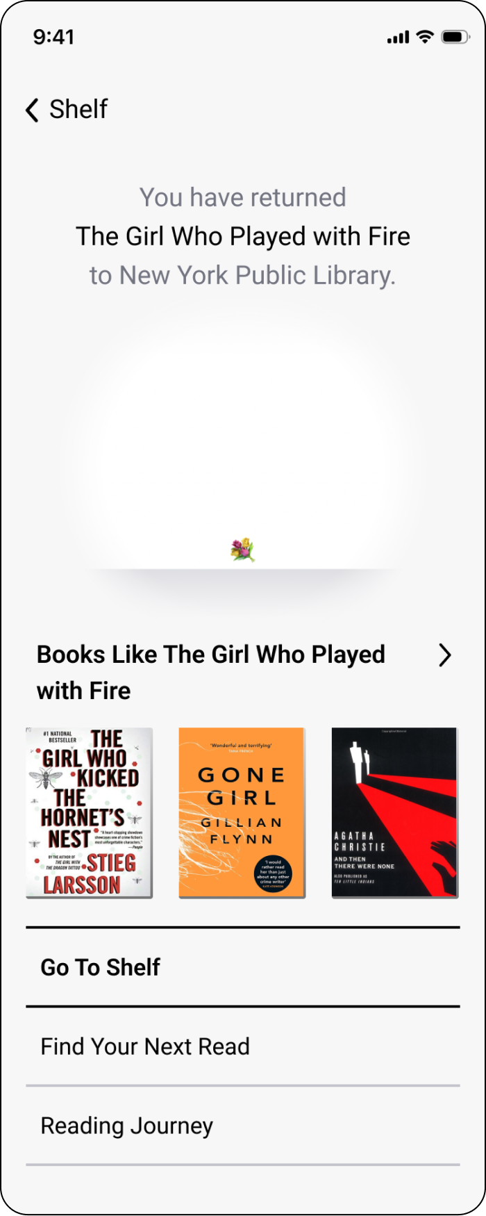
After Testing
I changed the copy of the previously existing button to more clearly communicate what it does.